So You Want to be a Critic!
Look at the work below, "Resources" and the detail of a chair, and let fly. Send your comments, whether fun, professional, quizzical, disgusted, amazed......
I had this idea, to get some responses to an artwork. The painting I had in mind pushed the visual language more than I usually do. I wanted to see what people thought.
So, I sent an email, inviting people to come to this page, look at the work, and then send me an email telling me what they thought. Eight people did.
I read and responded to their emails. Then, as I planned, I put them out of my mind. The next day, I walked into the studio, and looked at the painting, to see what it “needed.”
The finished work can be seen by clicking on it, below. The critiques of the original work are included beneath the original work and the detail of the chair, to the right. Also, there are my responses to the critiques.
 |
 |
|
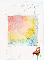
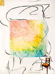
Resources, acrylic & charcoal on canvas 48x36 in. |
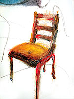
Resources, detail |
Click on the artwork to enlarge
NB:
By CLICKING on the above artwork and on the earlier version (up and to the right), you can see both versions while scrolling down the critiques.
CRITIQUE #1
A number of things delight me.
First of all, I think it's a bold move to invite others to criticize your work! Few artists do this and I think it's great and you did it with great spirit. Nothing better than a user-friendly artist.
Next,I have a "thing" about chairs, particularly small ones that I call "perching chairs," not quite big enough to spend a night on watching television, but big enough draw up to engage in a living room conversation or sit for a moment to lace up a boot. Mostly, they are charming and I see them as " jewelry" in a room. As an interior designer, I encourage them with clients and I have a number of such chairs in my home -- almost collecting them. I ponder your painting and I see something more. Here's this wonderful little chair that one could perch on to enjoy the painting which is so colorful and lighthearted and all kinds of good wiggles around it. Beneath your very serious and dedicated approach to your art I have always been aware of your sense of humor . What I think would exemplify that is to have the chair facing the painting, actually see it from the back suggesting the viewer might sit on it and soak in the vibrancy of the suggested canvas. That would tell a witty story and bring people right into your work.
I am also sensitive to titles of things -- paintings, poems, songs. I do not connect your title "Resources" with the subject.
Overall, i really enjoyed this painting -- a bright note in the day.
------------------My Response------------------
I’m glad you picked up on the chair. It’s become the key to the piece, and I enjoyed painting it more than almost anything else this year.
Titling a work is hard for me. “Resources” might be a mis-title. I wanted the painting to suggest resources for making sense of our lives. The big scribbles are the randomness of the universe; the color field suggests how we don’t see the world as it is unless we look beyond our “view,” and the chair suggests not looking at our personal construct of the world, but to look out. I like the chair. It is painful yet strong and beautiful, like the attitude that lets us see the randomness and order of the world.
By the way, I didn’t start out with the idea above. I didn’t start with any idea, except to make random marks, and search out what that might mean.
From my studio log:
8/26
Recently I’ve been asked a lot “how do you start/make your works?” I just started one today; and I think I’ll use it as an example for those who have that question.
I pulled out a 4x3 foot canvas, because I’ve been painting a lot of smaller ones lately. I thought I’d just start with random charcoal marks, and see what they suggested, tentatively thinking some recent drawings or “resource photos” would pop into my head.
Then I saw “I Am Smiling” (6/19/2009) nearby. I decided to generally copy the random incisions of that piece, knowing that the move from square to rectangular and 2 feet to 4 feet would spark something. As I carried “I Am Smiling” to the easel, I also got the idea to trace its square outside into the new work.
Great fun, like improv jazz, to “repeat” the random strokes in the new piece, in charcoal. Added a few marks, too--of course. After tracing in the square, just a little off center, I thought that scrubbing into that square with white pastel. Now something was happening! More charcoal and white scrubbing.
Idea: put in the chair that has been iconic for a while. Charcoal not too good. Colored pastel. Better. Scrubbed with white. Better still. More pastel. More scrubbing. Good.
I do not know where this all will go. Originally, I thought not to leave the main field white, since I’d done so much of that recently. Didn’t know where the “random” lines would lead, but liked the idea of random and color. Now, I’ll let the idea germinate, and probably flip through some sketches and my “art resource” photos.
8/28
Think I’ll call the new painting (8/26) “Resources.”
As I was painting some variations in my head last night, the right idea seemed to be to wash colors in the central area, colors like those of “Birth Edge.” As in that painting, the colors here would resemble the dawn and the beginning of universes and selves. The idea got better as I considered that the colored square could be a sunset as well, thereby creating that space I like, the kind that goes out of the painting. While looking at the “sunrise” in the painting, the viewer could be thinking of the “sunset” occurring behind him. As I was working on this today, things happened. Working towards a smooth gradient, I thought to work with the imperfections rather than smooth them. Many paper towels, wet rags, spritzes, color adds, and perspiration (literally) later, this area had developed into something more interesting that I first envisioned. Besides looking better, it suggests biological processes, and landscape forms emerging from energies.
Originally, I was going to keep the charcoal-on-gesso outer area, and paint the chair. Now, who knows what will come up as I start to work. Resources: the universe’s, mine, the painting’s.
-----------------------------------------------------------------------------
CRITIQUE #2
Interesting work. It seems to me to be unfinished or needs more of a connection to the observer. The black/gray lines are not clear or strong enough for me to see / fantasize the connection between the blended painting and the chair. The painting leaves me confused more than interested. If I saw the painting in a gallery, I would probably just walk by without giving it a second thought. Although I fully realize that I have a preference for realistic paintings, some of your other paintings seem much stronger and visually compelling than this one. So on a scale of 1-10 , with 10 being a painting that I must have in my own home or 1 being a painting that I would buy and use the canvas to paint my own painting over it. I would have to give this a 4. Sorry, and please do not give this any more importance than the constructive criticism/reaction you requested.
------------------My Response------------------
The difficulty here may be too big to be called a “problem.” It might be an unalterable “situation.” I see your points. My point was to explore the confusion you sense. Mutually exclusive? I am going to chuck your thoughts into my mind, let them form relations with other ideas, and see what happens.
I don’t think it is good writing, directing, or painting, to show confusion in a confusing way. I also know that an artist sometimes moves into new territory that is not understood at first. I further know that the previous sentence is used as a refuge for scoundrels.
I appreciate the critique, and thank you greatly for it.
-----------------------------------------------------------------------------
CRITIQUE #3
If I didn’t already know Robert Stanley is a teacher, I think I would have deduced the fact from this work. The artist might not be calling for interpretations in the work itself, but he might be showing color as witness to form. Or, he might not mind our seeking meaning in the work that he had not intended. If so, I sense a learning opportunity as the picture-within-the-picture reminds us of art itself, as in basic abstract expressionism, along the lines of De Kooning when he isn’t angry. The viewers, I feel, are symbolized by the chair. It brings us near realism to the moment of a dynamic encounter between our unreality and its reality. The wavy lines leading to and from the inner work call for notice, judgment and opinion if not also a critic’s action. But the hint of realism in the symbolic chair is challenged by the lack of geometric balance. We know from his other works that the artist can draw and knows perspective, but here the viewer is placed on unstable footing, reversing our usual assignments of stable viewer and reality against the art-within-art world of unstable fantasy, less definite than post-impressionist color fielding, but more universal than the early expressionism of AE works right before Kandinsky, where we see similar pastels striving towards form beyond their assigned areas. While the artist may have intended none of this, I bring to his work maybe too many comparisons, such as Vincent van Gogh’s famous chair. It draws us not towards another art work and not towards the chair as reality, but to the painting itself and its painterly details. Here with Robert Stanley’s work we see rather the artist as a channel offering us both art and a point from within it, with a minimum of attention drawn to himself or even his art-within-the art. He identifies with us, the viewers. I hear him ask with Pollock “I know it is finished, and I know its art, but is it a painting?” It is a question only the artist can answer and I believe Stanley has replied Yes.
------------------My Response------------------
“Aaargh” was my reaction when I read the first sentence, because I thought the painting might seem didactic, and I don’t want to make art that veers towards the propagandistic or pedagogic. Thanks be to the Flying Spaghetti Monster, you didn’t mean it that way, but instead, made me very happy by writing “The viewers, I feel, are symbolized by the chair. It brings us near realism to the moment of a dynamic encounter between our unreality and its reality.” Than, and you felt invited to come on in and find your own meaning. To me, that’s the dynamic tension between artist and viewer. I want the viewer to create his own meaning, but not if it would be of the same ilk as someone certifiably insane. A metaphor: the artwork is a created world. The viewer astronaut lands on it, and begins exploring. If, however, he’s, say, tripping on LSD or drunk out of his mind, the “world” he perceives likely will have nothing to do with the general nature of the world he’s in.
Some of your references to other artists are in the work. Those that I am not conscious of putting there, may (1) be there unconsciously, or, just as importantly (2) fall within the visual/emotional/mental “world” I mention above. I think you have read some things in the painting that I did not directly put there, but are certainly within my feelings and are a wonderful response from you. In some ways, the art is created in the space between the viewer and the painting.
I wish there were more chances for communication between me and the viewers of my work. Having learned much from your responses, I lament how much I must have missed, not hearing from others.
-----------------------------------------------------------------------------
CRITIQUE #4
Critic I am not. Opinionated I am.
The overall composition of the colored box keeps me glued to the center and eyes wondering where are you going?
The fill in lines help fill up negative space and the chair is the kicker. Especially with the one leg of the chair off the border of the work.
I know that the artist makes choices with every move of the hand which controls the medium. You image evokes questions of Whys?
Why scribble over the beautiful block of colors? Why center the block of colors and have the chair run off the page?
Then I reason that these are your tricks of the trade. The chair makes the image for me. It is like a resting place for me to relax after trying to figure your work out. Seems like you always do this to me Bob. I could imagine a whole series with this theme or whatever.
------------------My Response------------------
I am happy with this, because the viewer asks core questions. He makes it clearer why I like the chair, too--another example of artist AND viewer “making” the work. The chair is solid, yet not symmetrically secure. As mentioned before, I loved painting the chair, and hoped its position and weight would create a symbolic balance between security and anxiety. It seems that the chair is working, but, from this critique and another that was very uncomfortable, I wonder if the painting needs something in the upper left to keep the security/anxiety pendulum moving.
-----------------------------------------------------------------------------
CRITIQUE #5
As always, I am amazed at the simplicity of your approach. In this piece, and in others, I see a stronghold. In this case a chair, an island of refuge, or a viewing point that one can use to gaze into the work. Seemingly separated by different planes, yet abstract in content, changing every time you look into it. I can sense a path, perhaps a trail into a sunset, or maybe light at the end of the tunnel. At any rate, a window into a different world. If you look at it long enough you can see the makings of a human face,floating in golden clouds. Kinda makes you want to see what’s around the corner. I love it. Minimal and direct, but very deep.Truly an expression of the mind.-------------Yowsah!!
------------------My Response------------------
Good to know that the sense of floating among realities and sensing another corner to look around were felt. I had never thought of the floating point of view which often appears in my work as a “stronghold.” Makes sense--will think about it and explore that visually
-----------------------------------------------------------------------------
CRITIQUE #6 You must be the most brave artist I have ever met!! Generally, your art has so many layers, narratives and meanings, I really love to see your stuff! I really admire your sense of color and space. i see the world as crammed full of STUFF and you have a way of opening up all that. Your colors also tend to be calming and there is a vastness to them. Also, there are areas which you really seem to struggle with and those that seem so effortless. This, too, adds to your visual intrigue.
------------------My Response------------------
It’s sad, that Im thought of as “brave.” The trust between viewer and artist is, as this critic suggests, broken. Perhaps it is because big-time critics, curators, gallerists, and artists have no objective, common language. They often act like High Priests, with a secret language that only they understand. It’s not “right” to talk about color, shape, composition, technique as they relate to an idea. Is that ever dumb.
-----------------------------------------------------------------------------
CRITIQUE #7
Overall, I really like this piece. It is very thought-provoking. It makes me wonder whether the square rainbow in the center is the remnant of a thought from someone who sat in the chair and has just gotten up, or whether it's a 'thought' from the chair itself. I tend to like the idea of it being the chair's thought because it's, well, confined to a square just like the seat of the chair.
Love the imagery in the chair itself. The red, signifying blood (perhaps suffering) seems almost to be oozing out of the cushion and the back, perhaps from listening to and bearing the 'weight' of the people who have sat on it.
The random lines suggest to me that there is still creative thought going on even outside the confines of this world's rainbow of color. Interesting that you didn't use color for them. Much more thought-provoking with just black/gray lines.
Only one suggestion: If this were my piece (and because I'm a Christian and I believe my work should always reflect that), I would have had some very tentative feathered lines of color just barely extending themselves from the upper left of the rainbow square to show hope, yearning, reaching for the intangible, not getting there yet like with the curves black lines, but at least making some progress toward ultimate Freedom and Creativity.
------------------My Response------------------
It is good to know that my basic feeling, of there being something outside the ken of our thought, was interpreted in a new way. I wonder if the blood idea, which definitely was part of my thinking in making the chair, is too “ooze-y.” Did not want to limit the blood/red to just one interpretation. I’m also pleased that this other artist recognizes the importance of the black lines.
-----------------------------------------------------------------------------
CRITIQUE #8
My impression is that the painting is about patience.
------------------My Response------------------
“A time for every season,” eh? I do feel that deep watching and waiting leads to good things.
-----------------------------------------------------------------------------